Mental how there’s almost 400 people here. I hope the value you’re getting is worth reading my typo-filled, chaotic bits.
I want to steer slightly towards more type in these. Starting from early releases and maybe some exclusive stuff as well as the regular digital drops.
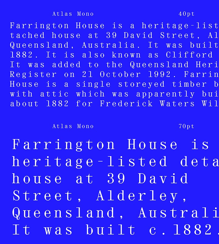
For now, let me introduce you to Atlas. I have been learning so much while drawing this, it’s mad. As a lover of learn-as-you-go, this was HARD. Nowhere to hide, nowhere to run. I wanted for it to be soft, but not really, which seems to be - increasingly - a feature I look for in the typefaces I design. Again, we likely design who we are.
I find it extremely hard to tie a project, to close it, to see the finish line. A font can be worked on until the end of time and somehow never feel finished. I’m a new me every time I sit here and so I bring a new perspective to the project, and often end up remixing some (or most) if it.
This feeling of always finished but never finished. Does it ever go away? Is there really a moment when a font is FINISHED?
I love the FutureFonts model, and I loved seeing Comma Type add developing stages to their work, I think it shows there’s an interesting in seeing the type out in action, to have it used, to have it circulate, even if it’s not “finished”.
So, while Atlas is not yet quite finished (am I just bad at it or is designing italics a pain in the ass?!), here’s a beta version of Atlas Mono.


You are free to use it for any personal and non-profit project, but if you’re looking for commercial use, please get in touch.


