#11 - Another 7 Open Source Typefaces, cus why not!
I LOVE THE INTERNET <3<3
It’s not a secret, and tbh, if you met my mum, you’d understand a lot. I’ve seen the woman hassle the price for my prescription specs. Unbelievable. But she’s not wrong. We do love a deal, but also, we do love a free bit.
So here’s another 7 (go back a few posts for the other list!)
What I’d love to point out too, is that you can use these as a basis to get handy with type design software, as the license allow you to do pretty much whatever (as long as you’re not changing the license model) with these, so you can open these in glyphs or whatever program you use and analyze the file, I promise, this is so helpful.
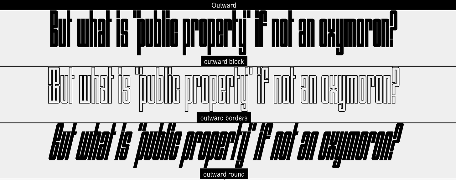
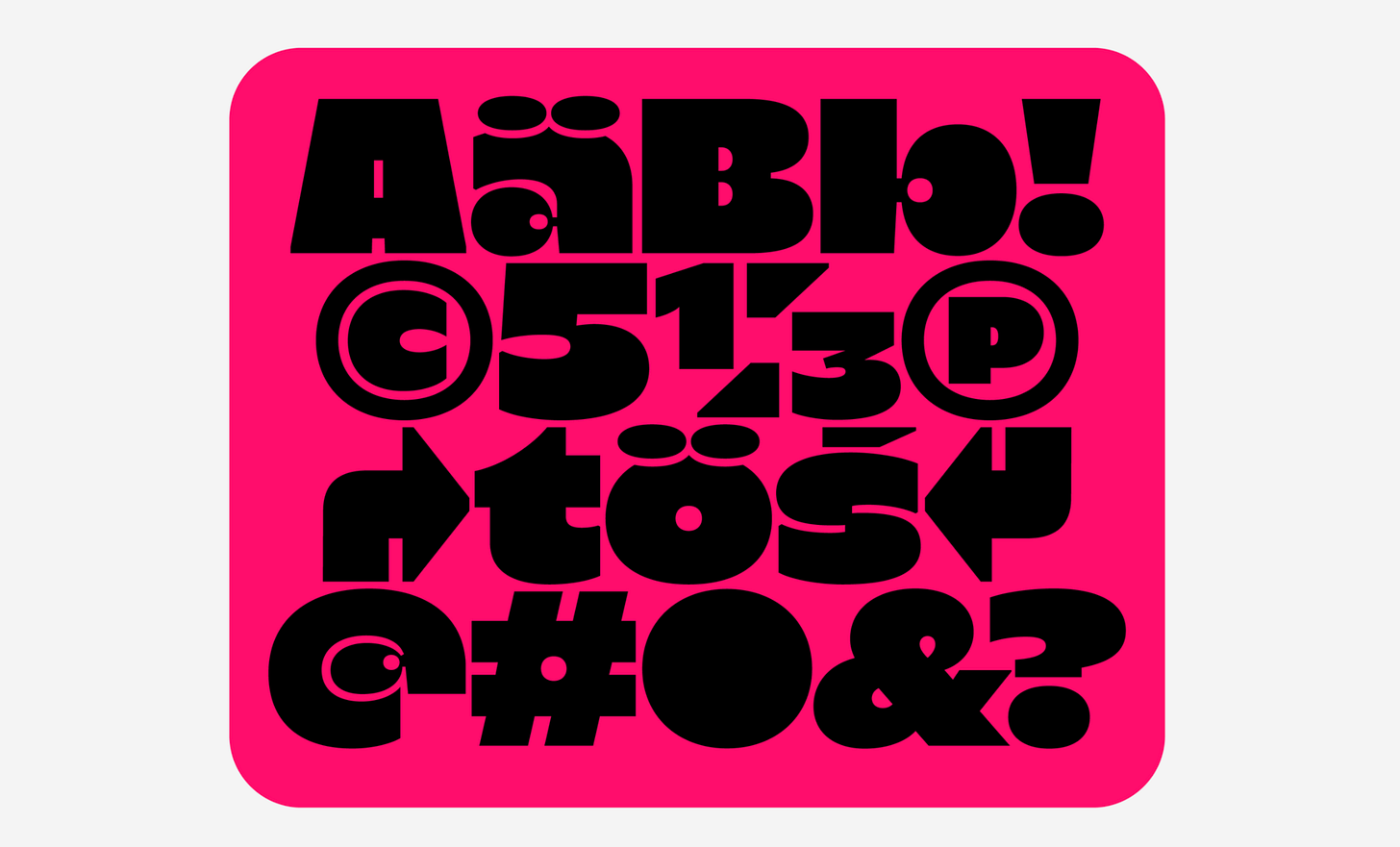
Outward
Designed by Raoul Audouin and distributed by Velvetyne, Outward is a display font family coming in three cuts: Block (regular), Round (italic) and Borders (bold). Outward Block was initially designed in capitals only with the intent of getting rid of white spaces to reach a black type color, as opposed to the ideal grey sought after by typographers. The extended set of characters and families was developped following this root.
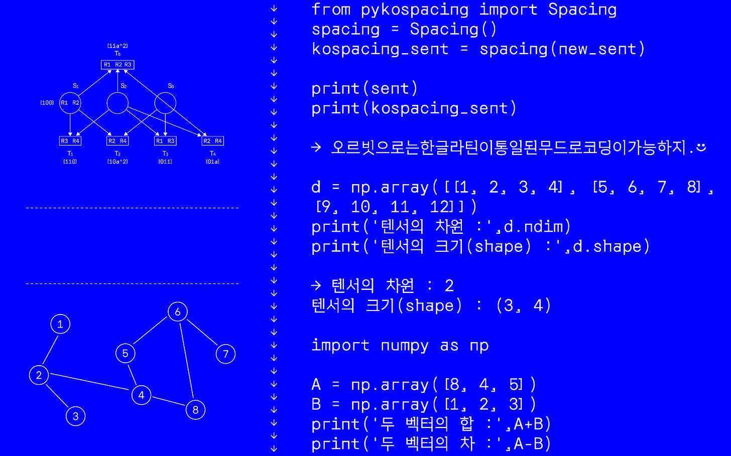
Orbit
Designed by Sooun Cho and inspired by monospaced Latin coding font. Korean fonts are usually already monospaced, but brought the impression of the Latin coding font in the Hangeul and punctuation designs. This font gives a mathematical and geometric impression through a serif with right angle and orbicular circle.
It is designed especially for Hangul typography, but it also includes Latin alphabet as a part of KS X 1001.
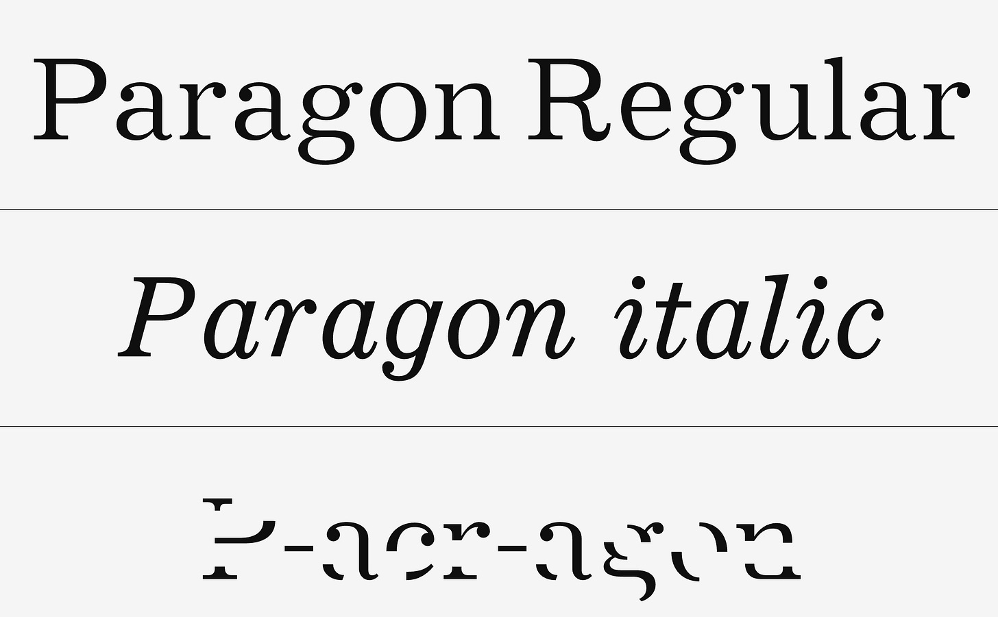
Paragon
Designed by Cédric Rossignol-Brunet, Paragon is a revival of a typography of the same name designed in 1935 by Chauncey H. Griffith for Linotype's Legibility Group.The a.c.r version of the typeface was designed based on Phil Baines' work on his You Can Read Me typeface. It seeks to establish a boundary where the typeface resists machine reading (OCR) while still being readable by humans.
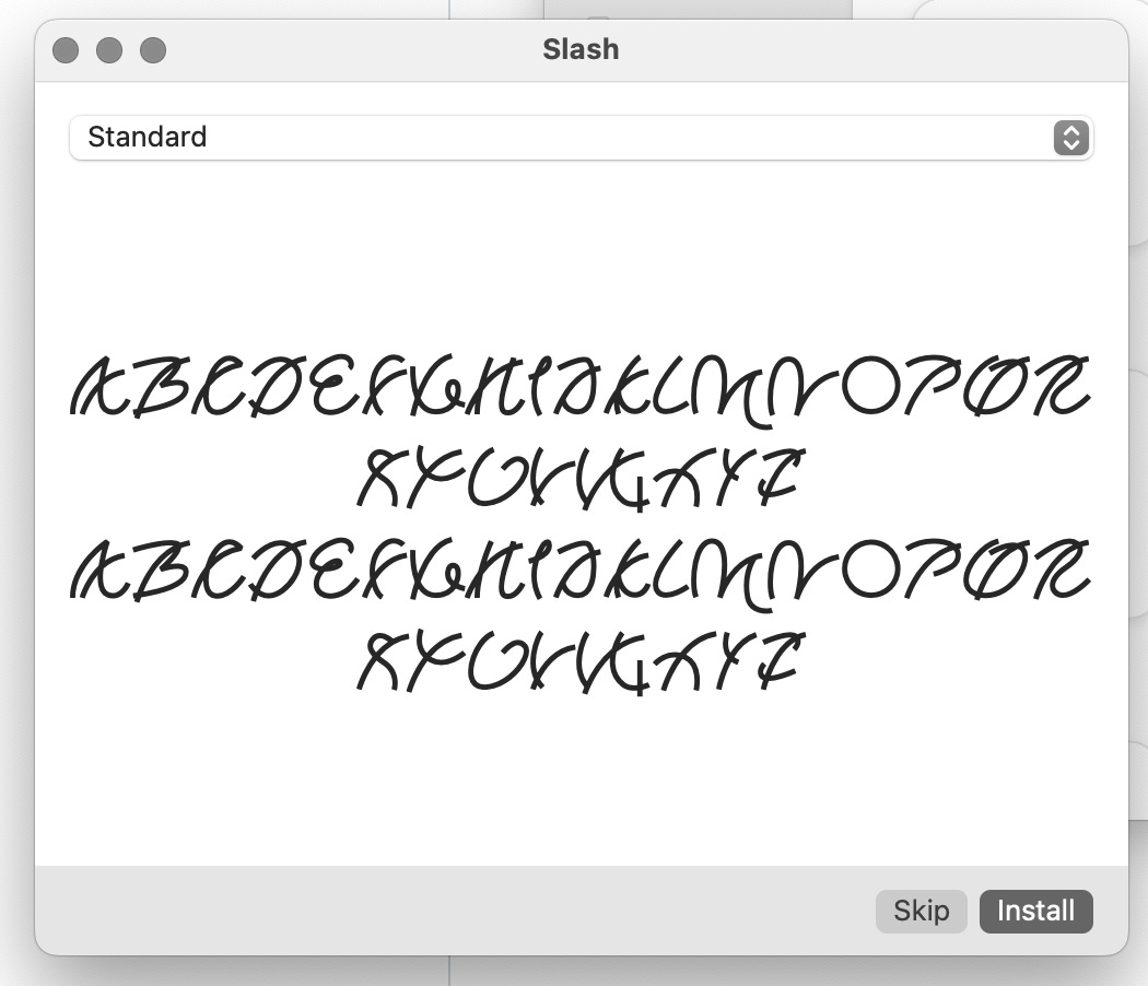
Slash
Designed by Rory King I really don’t know much about this typeface, but it’s mega fun and can’t wait to have an excuse to use it.
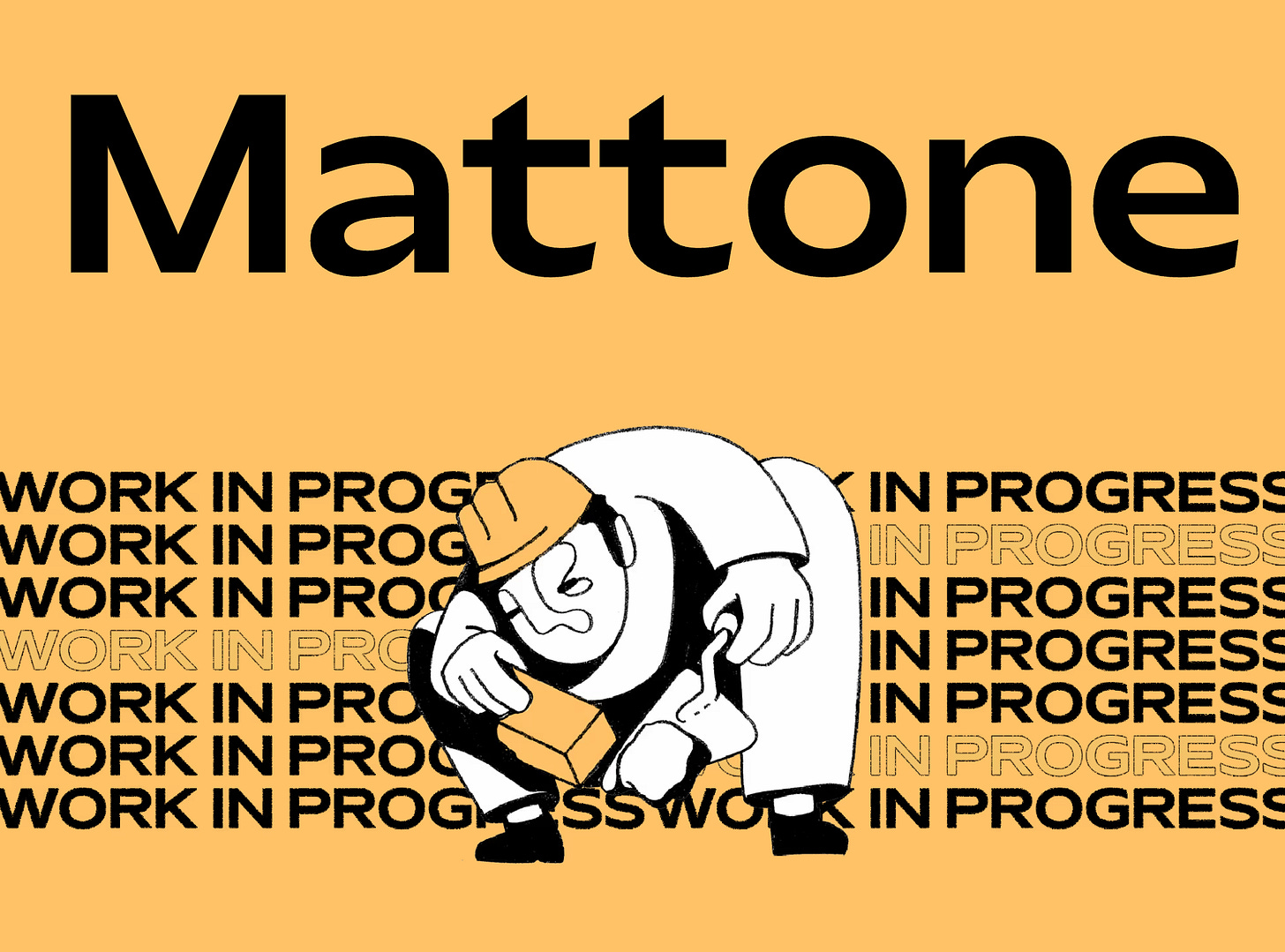
Mattone
Another one from Collletttivo, designed by Nunzio Mazzaferro, Mattone is a highly visible sans serif with generous width proportions and loud curves – as round as they can be. Initially started in 2017 as a display face, Mattone was completely redrawn from scratch in 2021 and can now set longer text pieces at smaller sizes with a broader language support.
We used this on the restyling for Typeone Magazine website, and I can’t wait for it to be out so we can show you!
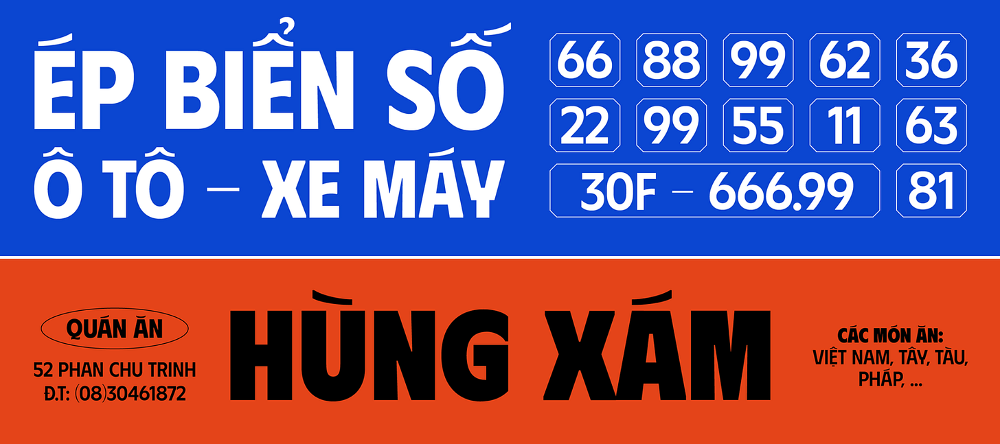
Phudu
Designed by Duong Tran and distributed by google fonts,Phudu is a sans-serif display typeface inspired by Vietnamese hand-lettering billboards in the old days, that supports a wide range of languages. As a new way to achieve variable font, the lighter Phudu gets, the extended it becomes, for people to read it easier compared to other lightweight narrow typefaces.
The typeface was named Phudu (phục dựng) - "revival" in Vietnamese, and has a meaning of timeless (quite the opposite of the name when it can be read as "phù du" - ephemeral).
Mogi
Designed By: Deni Anggara & mastered by Fadhl Haqq, LC Mogi Typeface is a playful font with its own strong character and unique charm. Adds an extra touch of playfulness with its distinctive bouncy and chubby letterforms, reminiscent of the plumpness of Bubblegum. It's is suitable for a range of design projects that require a touch of lightheartedness. Whether used in headlines, posters, or branding materials.
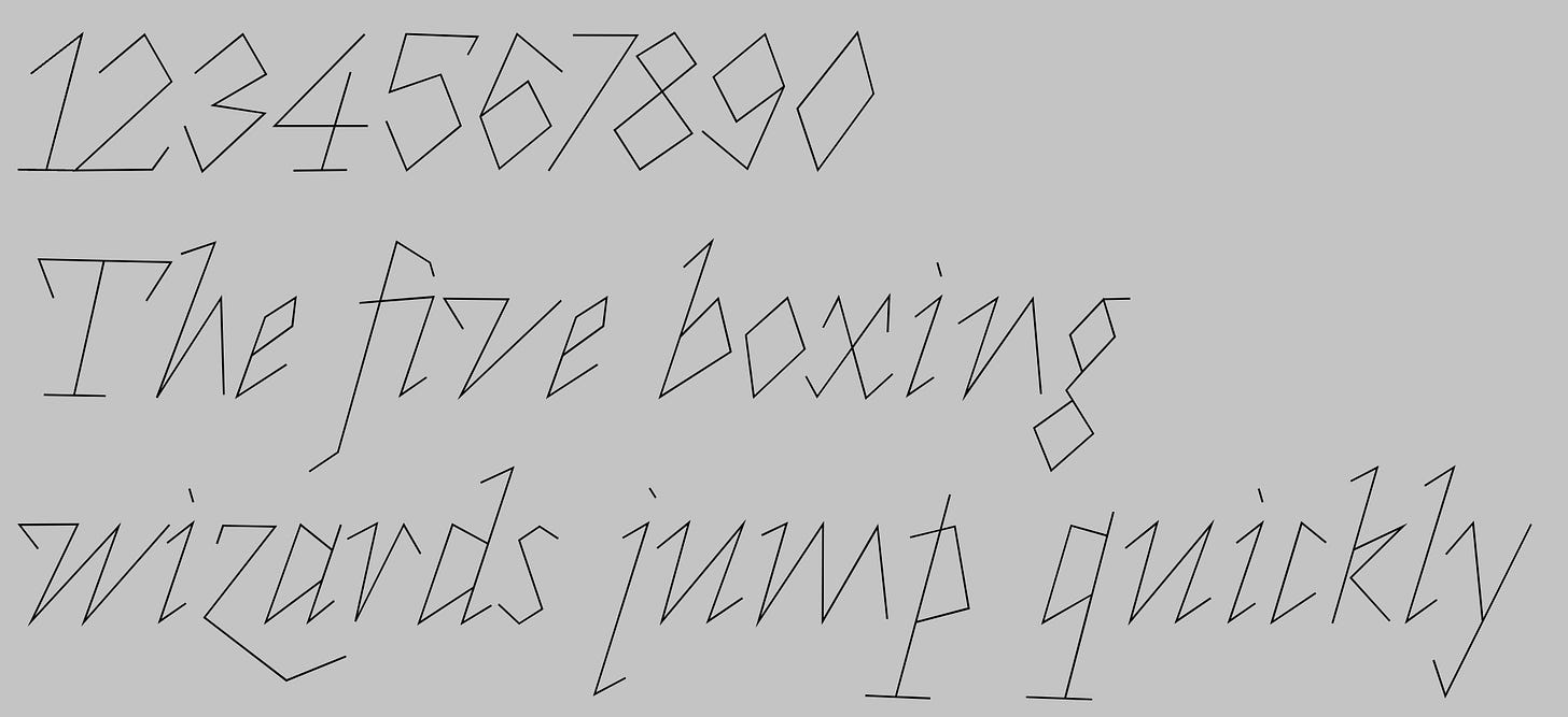
Roberte
Designed by Eugenie Bidau and distributed by Uncut, this is just so very fun I just had to include it in this list as we’re spanning across wildly different styles.
More soon about free fonts, as there’s SO MUCH great stuff there too.
If you like these posts or find them useful, share it with a friend or classmate!
xo
G


