
#08 - 7 Open Source Typefaces We <3
And so should you!

It’s not a secret I love the internet, I love open source, I even love piracy. So how can i not love free shit? But even better than free, it’s open source!
So here’s 7 Open Source Fonts I think we should all have in our arsenal!
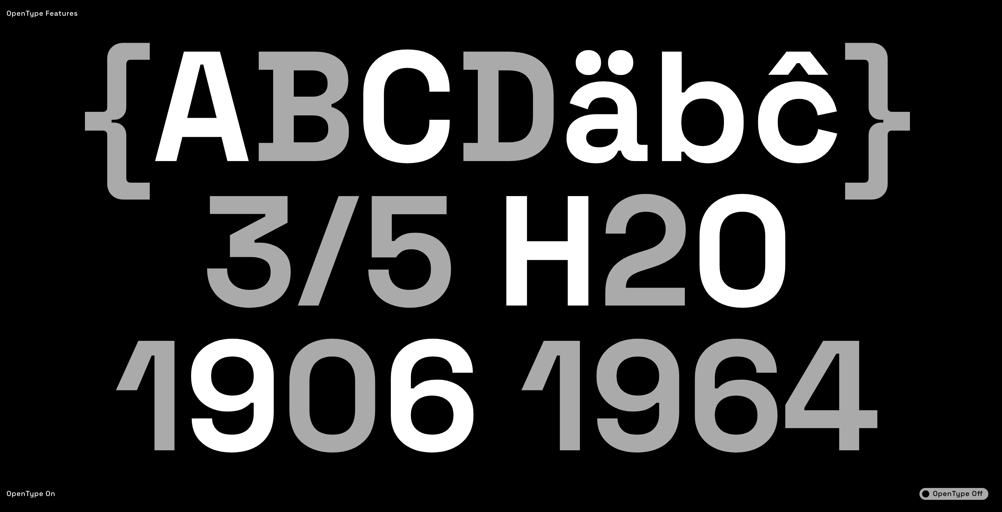
1)Violet Sans by Violet Office


Developed as our in-house typeface for all Violet Office communication, including this very website.
As a nod to the long tradition of geometric san serif typefaces, in particular Eurostile, Violet Sans has been developed for modern applications with a bit of experimentation and haphazard gestures built in. Allowing for different expressions within a single weight and style.
Download HERE
2)Mazius by Colllettivo
(Alberto Casagrande, Luigi Gorlero, Nunzio Mazzaferro)


Mazius is a high contrast serif typeface with old style proportions and a strong calligraphic feel. Influenced by chancery hands, it features two italics, each one with distinct personality. Use it at big size to create sleek headlines. Combine the three styles together for maximum expressiveness.
Download HERE
3)Nyght Serif by Maksym Kobuzan
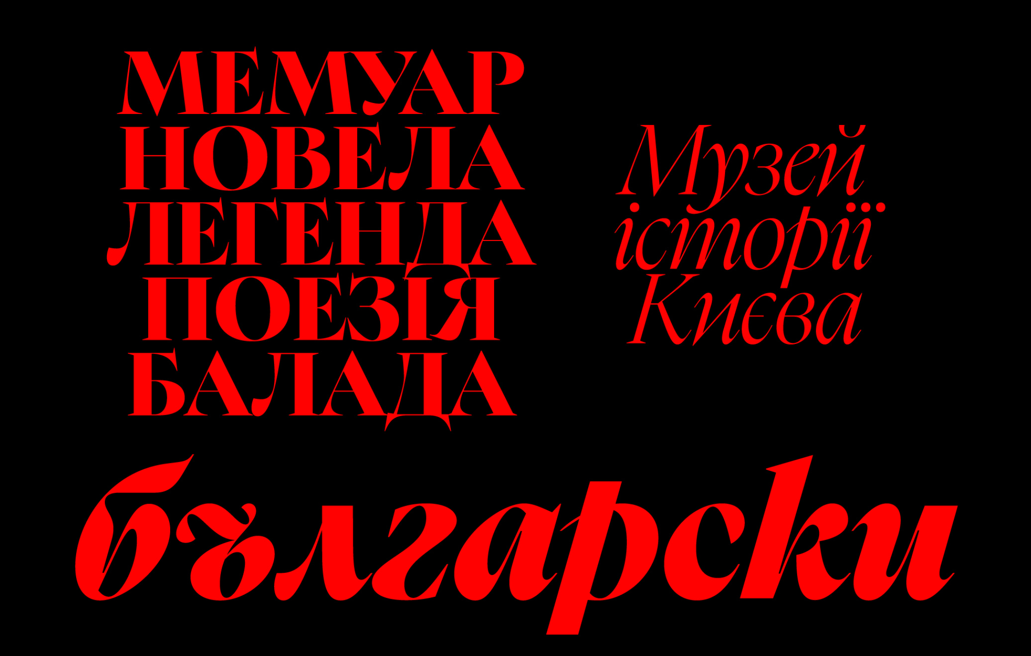


Nyght is a contemporary serif with a spicy character. Its contrasting forms combine smooth and sharp curves, like blade serifs and spurs. Work on it began during the study of the well-known typefaces designed by William Caslon. However, under the influence of calligraphy and modern serifs, its design has been greatly transformed. The typeface, designed by Maksym Kobuzan, presents a wide Latin character set as well as Ukrainian Cyrillic.
Download HERE
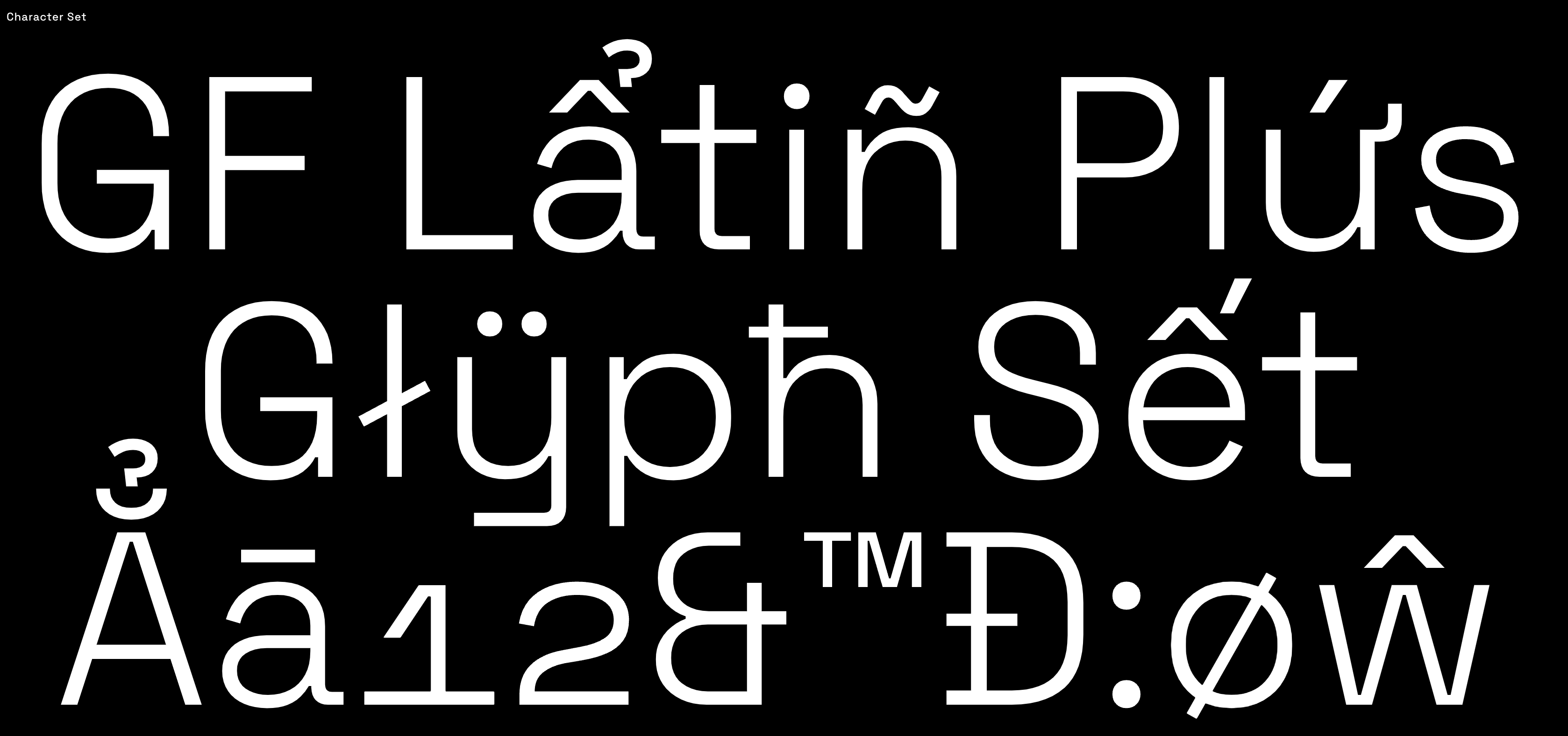
4)Absans - Colllettivo (Valerio Monopoli)
This one is fresh as fuck, literally just got out a few days ago, and we’re already OBSESSED.


Absans clearly nods to early 20th Century grotesque fonts, with their quaint yet captivating flaws. It suits delicate and elegant compositions, appealing to both casual readers and font enthusiasts with its subtle, distinctive charm.
Download HERE
5)Space Grotesk
Space Grotesk is a proportional sans-serif typeface variant based on Colophon Foundry's fixed-width Space Mono family (2016). Originally designed by Florian Karsten in 2018, Space Grotesk retains the monospace's idiosyncratic details while optimizing for improved readability at non-display sizes.
Download HERE
6)Inter by Rasmus Andersson
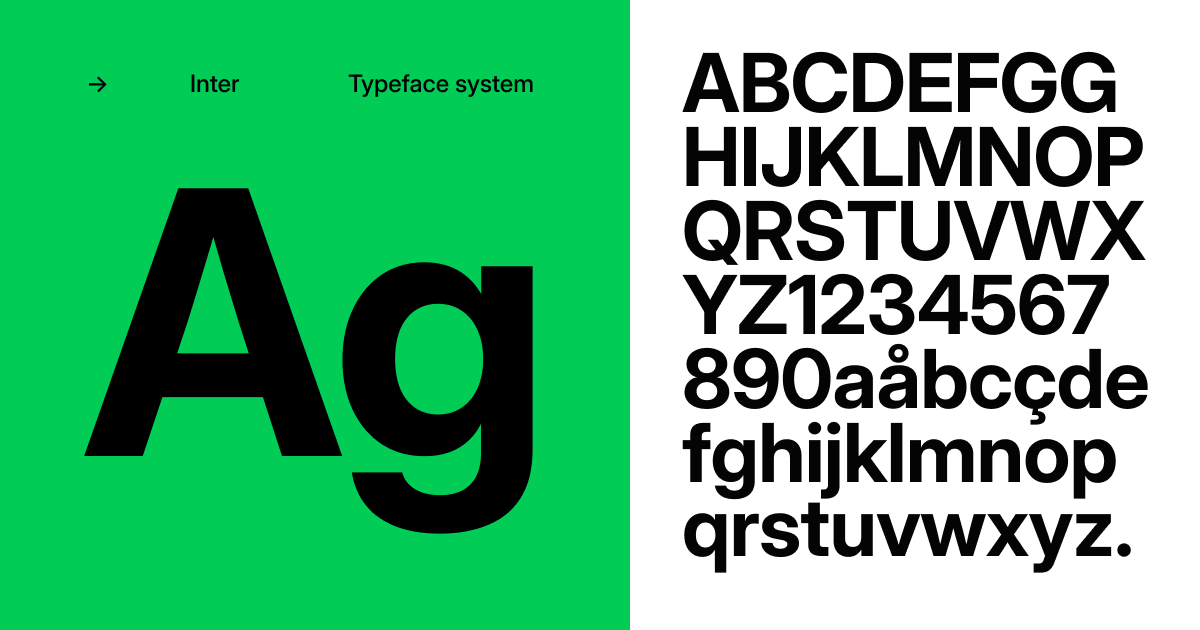
Fairly obvious choice on this workhorse of a font, but I think we all need an unpretentious well engineered basic face sometimes.
Carefully crafted & designed for a wide range of applications, from detailed user interfaces to marketing & signage. The Inter typeface family features over 2000 glyphs covering 147 languages. Weights ranges from a delicate thin 100 all the way up to a heavy 900. Each glyph has three dedicated designs for weights 100, 400 and 900 to ensure excellent quality at any weight. Optical size ranges from "text" to "display" and there is a true italic variant.
Download HERE
7)Galgo by yours truly
Because I’m a bit of a piece of shit so I want y’all to use it, but also cus I think it’s a very valid typeface I’ve expanded from Morganite (Rajesh Rajput) and now can stand on its own and have a clear identity and personality.


Download HERE
Have fun designing!
xo
G